Thursday, December 8, 2016

2016 CCRPI Results

The Georgia Department of Education released 2016 CCRPI results today (12/8). The district overall score decreased 1.8 points from 67.0 to 65.2.  Similarly, the overall score for the state of Georgia fell 1.9 points from 75.5 to 73.6. 

The view below is created using the state's results file and includes all Georgia public schools and districts. It is currently filtered to compare APS' 2015 and 2016 results by grade band and CCRPI component, highlighting that in each grade band APS maintained Achievement points but lost some ground in Progress points. 


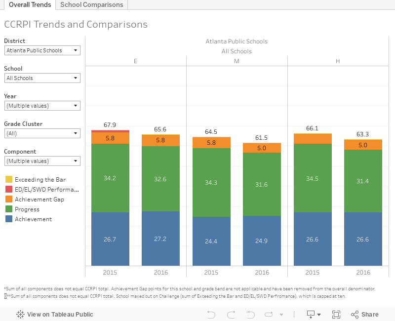
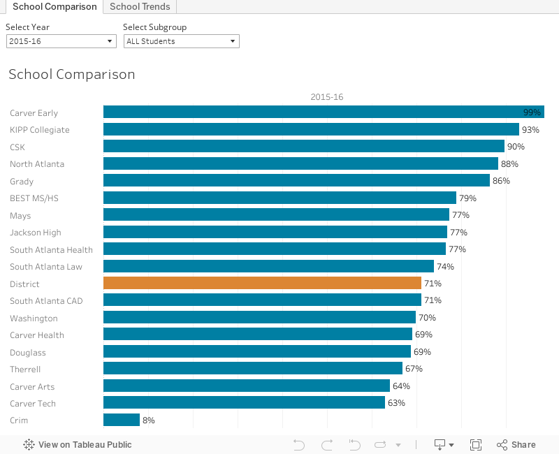
Use the filters to compare results across Georgia districts or schools. When looking at district results, set the school filter to "All Schools". The "Schools Comparison" tab shows 2016 results for all APS schools and gains or losses over 2015 scores. Use the "Components" filter to see how schools resort based on individual CCRPI components.

Visit the GADOE CCRPI page for more information about CCRPI and to view detailed score reports. See more APS results, including Progress Point trends on our data report, or read the superintendent's blog.

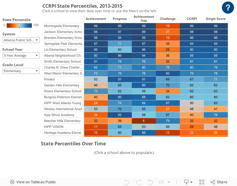
The example below shows how the data visual can be used to view a school’s trend over time. Cleveland Elementary School has consistently grown their CCRPI since 2013, and earned 40 progress points in 2016, the maximum possible amount. Progress points are a useful component because they measure how much student achievement grew during the year, taking into account their scores from the previous year. Also note that the state’s CCRPI calculation changed in 2015 so progress became a larger component.

The next example shows how the data visual can be used to make cross-district comparisons. District-level elementary school CCRPI scores are displayed for six large metro Atlanta districts. Gwinnett County earned the most progress points of the six districts in 2016 and had the highest overall score.


CCRPI Components
Each school receives an overall Single Score. Each grade band within a school receives a CCRPI Score. These scores are made up of four components: Achievement (50), Progress (40), Achievement Gap (10) and a max of 10 Challenge Points. Challenge points include ED/EL/SWD Performance and Exceeding the Bar. Scores prior to 2015 should not be directly compared to scores from 2015 and later due to changes in calculations.

Tuesday, November 1, 2016

2016 Graduation Results

Graduation rates for cohort 2016 were released today (11/1). The view below shows the percentage of four-year graduates by school and district (orange). 

Overall, the district graduated 71.1 percent of its students in four years. This is compared to 71.5 percent in 2015. State-wide, the graduation rate is 79.2 percent.


Use the "Select Cohort" filter in the upper left-hand corner to see graduation rates from previous school years. To see one school's rates for the past six years, click on the "School Trends" tab then use the "Select a School" filter. 
Graduation rates for small APS schools that are now operating as one large school (Ex: Therrell Health, Law, and STEM) have been consolidated to more easily identify trends. 

Cohorts are based on the year students first enter ninth grade. The graduation rate is the percentage of these students who graduate within four years, adjusting for transfers. Read what Superintendent Carstarphen has to say about APS grad rates on her blog, and get grad rates for all Georgia schools and districts here

Friday, July 29, 2016

2016 Milestones Results

2016 Milestones results were released by GADOE this Tuesday (7/26). The visual below shows achievement levels by school.

Use the filters on the left to focus on a specific grade or subject, or to switch to elementary school. Use the tab at the top to switch to End of Course exams (high school). This view was created with the state data file, so users can also use the "System" filter to view other districts.

Notice that the view is sorted by the percentage of students scoring at the beginner level, but the relative ranking changes if a different category is used. Atlanta Classical Academy, which is our middle school with the lowest poverty rate, has the most students scoring above beginner. However, Inman middle school has a much larger percentage of students who reach the distinguished level. Achievement results tend to be highly correlated with family income- see last year's post on poverty and test scores.

The achievement level view is great for understanding how students compare to state standards and to other APS schools. The description of each state achievement level is available here. For a summary of overall APS performance, see the superintendent's blog.

The next view converts average test scores for each school into a state percentile. This view is more helpful for comparing performance over time, across grades and subjects, and to the rest of the state.


The percentiles show a school's relative position among all Georgia schools. For example, a percentile of 45 indicates a school's average scale score is as high or higher than 45% of schools in Georgia. For a more detailed description of the percentile view, see our previous percentile post

Note that the EOG percentiles view does not include advanced math students in eight grade who took the EOC, but they can be found on the EOC tab. This causes schools with a large advanced math program like Inman to have a lower 8th grade math percentile on the EOG view. 2016 is the first year that advanced math students did not also take the grade level exam.

To see more updates on district Milestones results, follow us on twitter or use the e-mail subscription on the left.

Finally, to indulge a data analyst who also thinks he's an artist, here's a picture of achievement for all elementary schools in the state: 


To see a more readable view of the same data, scroll to the achievement visual at the top of the post and select system = "All".

Tuesday, May 10, 2016

CCRPI State Percentile Ranks

The Georgia Department of Education released 2015 CCRPI results on May 3. The CCRPI is a great data set for understanding school performance. The state provides detailed school drill-downs here. However, for those who don't have a job that involves combing through CCRPI data, sometimes a single school report lacks context. For example, what is a "good" progress point score? These questions are even more relevant because both the state test and the CCRPI formula changed in 2015.

One way to add this context is to look at how a school's score compares to the rest of the state. As a supplement to the state data views, we made the view below that shows the state percentile rank for each CCRPI component.


Remember that each value is a state percentile, not their actual score. For example, the top result shows that Morningside's three-year average of achievement scores was in the 99th percentile in the state, and their three-year average of progress scores was in the 98th percentile. For more details on CCRPI indicators, see this page (the "General Resources" and "CCRPI Indicators" options on the right are particularly helpful). For more details about the visual, mouse-over the question-mark icon in the top right.

It is also helpful to look at this view in conjunction with other Milestones indicators. One such case is the progress component for elementary schools. The progress indicator only measures growth in 4th and 5th grades. Our view of test scores vs. challenge is a helpful compliment because it better captures the cumulative effect of the first four grades and makes comparisons to similar schools.

Three year averages are shown as the default view because the single-year fluctuations in a school's CCRPI tend to be temporary changes, as opposed to long-term trends. This is demonstrated in the correlation table below. If score changes were indicative of a long-term trend, then scores in adjacent years would be the most correlated. However, the correlation between 2012 and 2015, 0.86, is as high as any other correlation. This suggests that the majority of score changes are actually temporary fluctuations and that a multi-year average provides more information about school performance.


The CCRPI is composed of many different indicators and the data required is complex. In 2015 a few of our schools did not receive full credit due to data reporting problems. These errors were usually worth 1-3 CCRPI points. ANCS Middle and KIPP WAYS did not receive full credit this year for students who completed individual graduation plans and career inventories. Grady High School did not receive credit for the American Literature and Composition scores of students enrolled in AP English.

For more information about 2015 CCRPI results, see the superintendent's blog here, or our 2015 CCRPI data report. Or, let us know if you have questions on twitter.

Thursday, March 31, 2016

Milestones to National Percentile Conversion

The switch from CRCT to Georgia Milestones will benefit Georgia education in several ways. The more rigorous achievement levels will better inform schools and parents of their students' readiness for college and career, and the open-response questions will increase emphasis on writing instruction and critical thinking. 

In addition to increased rigor and open response questions, the 2015 Georgia Milestones results include national percentile scores. These scores are reported for each student as a supplement to the achievement and scale scores, calculated using a subset of 20 nationally-normed TerraNova items for each exam. This is a common psychometric method for creating a national percentile, but can yield odd results due to the number of questions and curriculum alignment. For example, the graph below shows the relationship between student's eighth grade science scale score and their national percentile.

Scale Score vs. National Percentile, 2015 APS Eighth Grade Science Milestones

Although students who have a high scale score tend to also receive a high national percentile, the graph shows substantial variation. Students who scored at the high end of Beginner (~470) received a national percentile of anywhere from 1 to 94. 

This variation is likely because only a subset of questions are nationally-normed. Although this method of calculating national percentiles is common, we recalculated national percentiles with a method that preserves students' scale score rank order. To do this, we used NAEP results to compare Georgia test score distributions to the national distribution, and then used that information, in conjunction with state means and standard deviations on the Milestones exam, to convert each scale score directly to a national z-score. We then used a cumulative normal distribution to convert from national z-score to national percentile.

We put the results in the visualization below. Select a grade and enter a student's Milestones score for each subject to see their national percentile. The visual also shows a confidence interval, based on both the Milestones scale score uncertainty, and the uncertainty in the relationship between Georgia's mean and the national mean. For example, the default view shows that a seventh grade student with an ELA scale score of 456 has an estimated national percentile of 19. The upper bound of the estimate is 30, and the lower bound is 11.


These percentiles were based on 2015 data, but should be mostly unchanged for 2016 results. As a final comparison, the graph below shows the relationship between scale score and the APS-estimated national percentile for each grade and subject. Notice that each scale score has only one estimated national percentile instead of a large range.


Let us know on twitter what you think, or if you'd like more details on the conversion formula. See the superintendent's blog for more information on Milestones performance in Atlanta Public Schools, or see previous posts on this blog.

Monday, February 15, 2016

APS Enrollment Data

Much of our work in Research and Evaluation involves looking at student outcomes, as demonstrated by the earlier blog posts about Milestones. But we've had several requests for enrollment information lately, so we pulled the October student count data from GADOE and made the following visual:


Mouse-over the visual to get exact numbers. The graph shows that the number of total students in APS has decreased from 59,560 to 51,500 students from 1994 to 2015. But there has been some increase since the 2009 low of 48,909. Demographics have also shifted: from 91% black in 1994, to 75% black in 2015.

The graph has several interactive features: choose a specific school or grade using the filters on the right, or use the tabs at the top to change visuals. The images below show a few different views that can be made using this visual.


Mary Lin Enrollment Over Time (Click to Enlarge)

KIPP Enrollment Over Time (Click to Enlarge)

APS Enrollment by Grade (Click to Enlarge)

The top graph was made by filtering to Lin Elementary School. The next graph was made by selecting the "Over-Time Multi-Select" and selecting all KIPP schools. To make the final graph, select the "Enrollment by Grade" tab and change the graph type to "Line".

Some schools in the state data file that were closed at least ten years ago do not have school names. The data for these schools appear if school name "Null" is selected.

The three graphs above are screenshots, but Tableau Public also allows users share a link to a customized graph. After selecting filters, click the "share" button in the bottom right and then copy the link. Did you make any interesting graphs with this tool? Or have questions? Let us know on twitter with #APSdemographics.

Tuesday, January 5, 2016

High School Milestones Results and Incoming Test Scores


The visual above shows high school performance on the 2015 Milestones and how the same students performed on their 8th grade CRCT. This gives us a picture of how students have grown at their high schools. Data points above the trend line show schools with higher Milestones results than other APS schools with similar students.

This view is a useful measure to think about school productivity. To see Milestones End of Course (EOC) data in terms of achievement levels, see this post. Both data views are helpful for understanding school performance, setting goals, and developing strategies for improvement.

There is a very strong relationship between average incoming 8th grade scores and current test scores- prior test scores explain 94% of the variance in current test scores at the school level. This result is similar to the amount of school test score variance explained by poverty for elementary and middle schools. That post also gives useful context for the high school visual. Although the graph is a useful measure of productivity, it is not comprehensive: "A school that is below the trend line this year might move up next year. Progress points on the CCRPI are a nice compliment to this view. And, perhaps most importantly, test scores are only one measure of a school's outcomes. It's also important to consider information like behavior, student engagement, or relationship with the community."

Test scores in this visual are graphed using NCE scores, which are similar to scale scores, but better for averaging across subjects because they have a uniform mean and standard deviation. This visual also provides criterion information with hover text; mouse over the graph to see the percentage proficient on the Milestones, and percentage Exceeds on the CRCT.

The use of incoming test scores as a control variable incorporates middle school effectiveness into the results. For example, we know from APS middle school data that KIPP middle schools tend to out-perform other schools with similar poverty rates. Many of these students go on to KIPP Collegiate. It is more challenging to sustain performance levels of students who have attended previous high-growth schools than it is to sustain performance of students who attended low-growth schools. Education research shows that interventions often have a fade-out in years following the intervention of 1/2 to 3/4 of the original positive effects. In this case, an effective middle school is the intervention, and the high school must also be above average to prevent fade-out.

Other useful information on APS EOC Milestones results can be found on the superintendent's blog, and in this visual that shows each school's state percentile rank by exam.