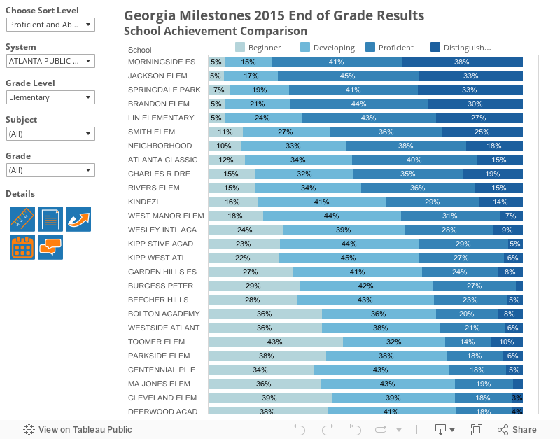
The graph above shows 2015 Milestones results by school. The default view averages across grades and subjects. Use the filters on the left to select a subject, grade, or grade level.
This visual provides both criterion-referenced and comparison data. Achievement bands color-coded in shades of blue- beginner, developing, proficient, and distinguished- show student performance according to state achievement criteria. This helps us understand how students are performing relative to a standard. The data sort, by percentage proficiency or higher, also allows the user to compare schools. This gives additional context to school performance. The sort-order can be changed to developing and above or distinguished using the drop-down in the top left. Over the next couple weeks, we'll release other dashboards that provide additional comparisons.
The superintendent provides more detail about district-level achievement results on her blog.
Filter to a specific subject to see that school performance is not uniform across subjects. Although Morningside has the highest rate of percentage proficient and higher when averaging across all subjects, Brandon has the highest rate for ELA, and Mary Lin has the highest rate for math (Morningside has the highest rate for both science and social studies).
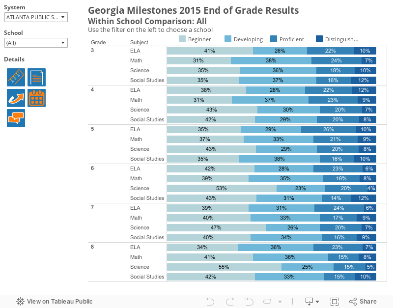
The view below shows a within school comparison. Use the filter on the left to select a school. This view helps identify areas of strength and areas for improvement. For example, filter to Beecher Hills. This view shows that their achievement levels tend to be highest in third grade.
These views were created with public Milestones data from GADOE and the original files contain data from all schools in the state. We've left this data in our visuals; use the system filter to choose and view data for any district in the state.